
How this guide works
For a contemporary interior design direction, start with a clear line-and-shape pairing: a slim console beside rounded objects, a straight sofa with a circular table, or a curved seat with a crisp color accent. Look for that relationship in furniture you already have. A small change in an accessory can make an existing outline more noticeable without requiring the room to be refurnished.
These ten examples are options for comparing a room’s appearance, not a forecast of what everyone should buy this season. Choose the zone you want to work on, then read across the selector for its main line, contrasting form and accent color. The object counts describe each pictured arrangement; adapt them to the surface and belongings you use.
Choose a contrast between lines and shapes
Identify the strongest outline in the zone: horizontal, angular or curved. Then try one different shape beside it. A round bowl can stand out on a thin rectangular table, while a straight fold of fabric can interrupt a curved seat. Keep the first experiment small enough that you can compare it with the original view before adding a second contrast.
In Tate’s art vocabulary, composition concerns the arrangement of elements in a work. The decorating choice here is how two unlike shapes share attention. Decide which should lead and which should support it; a console and its objects do not need equal visual weight.
Separate the furniture outline from its surface
Silhouette and texture can point in different directions. A lounge chair may have angular sides but a soft-looking surface; a dresser may have a straight front with rounded objects on top. First compare the outlines, then decide whether more texture would help. If the furniture already has a strongly textured cover, a smooth bowl may be enough.
Tate’s term form includes an artwork’s physical nature and shape. Here, it provides a useful vocabulary for describing the contrast you can see. It is the relationship between shapes that matters to these examples, rather than a claim about a named designer or a piece’s age.
Give the accent a specific amount of space
Cobalt appears as a small vessel in the entry example; ink blue covers most of the bed in another. Those choices change the balance in different ways. Decide whether you want a brief point of color or a broad area before selecting an accent. Compare a cushion-sized patch with a larger textile you already own instead of assuming more color will improve the result.
Proportion describes relationships between parts and a whole. Consider the accent beside the furniture, not on its own: a small saturated object can be prominent on a long pale surface. The selector records one combination per image, so its counts and color areas are examples rather than a formula.
Check straight and angled views
A front view makes a table edge easy to compare with chair backs. An angled view may reveal that the same table dominates the approach to the room. Look from both places you actually use before deciding which outline should be emphasized. Keep everyday seating, working surfaces and access useful while judging the decorative details.
Tate explains perspective as representing three-dimensional space on a flat picture. A photograph helps compare outlines, but its crop can conceal parts of a room. Include the edges of the relevant furniture when comparing two arrangements so that a tighter frame does not make the decision for you.
Use the selector to choose one experiment
Pick the row closest to your existing furniture, then test only its line-and-shape relationship. Try the bowl against the table edge, the cushion against the chair outline, or the textile against the bed. Add the suggested color only if it helps that relationship. You can retain a useful object that does not appear in the picture and still use the comparison.
For more emphasis on geometry, compare Art Deco interior design ideas. The mid century modern decor ideas explore another set of furniture shapes and warmer accents. For balanced groupings with more decorative detail, see traditional interior design ideas.
On this page
1Gallery-white entry
The black console draws a long, thin line across the pale wall. A shallow tray and two rounded forms interrupt that line at a small central point, with cobalt providing the strongest color. This pairing is useful if your console already has a fine outline but the objects above it feel unrelated. Compare one rounded object on its own with a compact group. A taller arrangement may compete with the wall behind it, while a lower one lets the furniture stay prominent. Give practical entry belongings a usable place within the plan.
- Why it works
- A small blue form gives the slim black console a distinct point of contrast.
- Best for
- An entry where the console outline is worth keeping visible.
- Check first
- Check the view with keys and other daily belongings present, not just decorative objects.
2Taupe sofa curve
A low round table and bowl soften the straight edge of this taupe sofa. The two saffron cushions supply color at the ends, leaving the middle upholstery visible. Decide whether the circular form or the yellow accent is the part you want to notice first. If both feel equally strong, try one cushion or a quieter bowl before changing larger furniture. This comparison is about a straight seat beside rounded forms; your own table can stay if it already works for the room.
- Why it works
- The round table repeats the bowl shape against the long sofa edge.
- Best for
- A straight sofa that could use a softer shape nearby.
- Check first
- Two cushions are optional; keep the seating comfortable for the people using it.
3Graphite dining line
The dark tabletop makes a strong rectangle, while the two rounded chair backs interrupt its straight edges. A rust-colored runner crosses the surface, giving the smaller bowl and forms a shared place. Look first at the table and chairs without the display. If those outlines already produce the contrast you like, the runner alone may be sufficient. A daily dining surface also needs to clear easily, so avoid choosing a decorative group that makes setting the table a chore.
- Why it works
- Curved chair backs stand apart from the thin rectangular table.
- Best for
- A dining set with a useful contrast between tabletop and chair outlines.
- Check first
- Judge the arrangement with enough usable tabletop for your normal meals.
4Warm-gray dresser arc
Three rounded vessels gather on a teal tray above the broad dresser front. Their different heights create a small rise and fall without covering the entire horizontal surface. Try the grouping toward the middle, then compare it with a position that suits where your daily belongings sit. The important choice is whether the rounded objects can be seen as one group. Spreading them across the full dresser changes the effect and may make the outer surface feel busier.
- Why it works
- The vessel group adds rounded shapes above the dresser's straight front.
- Best for
- A dresser that can accommodate a compact display alongside everyday storage.
- Check first
- Leave a convenient place for belongings that need to be set down temporarily.
5Chalk bed contrast
The bed pairs a broad blue textile with a pale rectangular headboard. Unlike the small cobalt entry accent, the blue covers most of the main furniture surface, so it leads the room's color. Compare this with a coverlet folded toward the foot if you prefer the pale bed outline to remain stronger. The matching bedside tables and low bench add straight lines, but you do not need those extra pieces to try the color relationship. Start with the bedding and headboard you already have.
- Why it works
- A large blue area contrasts with the pale headboard and surrounding furniture.
- Best for
- A bedroom where the bed should carry the main color statement.
- Check first
- Use actual bedding care information when choosing a cover; the image only shows appearance.
Quick comparison: all 10 ideas
Swipe or scroll horizontally to compare every column.
| Design Direction | Best Existing Zone | Open Field | Main Line | Counterform Texture | Accent Note | Object Grouping | Visual Stop Check |
|---|---|---|---|---|---|---|---|
| Gallery-white entry | Entry console | Open wall band | Slim black horizontal | One rounded stone form | Cobalt blue | One tray and two matte forms | Stop before the wall band loses its width |
| Taupe sofa curve | Living seating | Clear center seat | Low straight sofa | Low round table and bowl | Saffron | Two cushions and one low bowl | Stop while the center seat stays open |
| Graphite dining line | Dining table | Open table ends | Thin dark rectangle | Rounded chair backs | Rust red | One runner, one bowl, and two matching forms | Stop before either table end gains an object |
| Warm-gray dresser arc | Dresser top | Blank outer thirds | Long pale plane | Three rounded vessels | Deep teal | One tray and three graduated vessels | Stop while both outside thirds remain blank |
| Chalk bed contrast | Bed zone | Clear bedside planes | Low upholstered rectangle | One softly folded coverlet | Ink blue | One coverlet and two pillows | Stop without adding bedside objects |
| Pale-oak shelf rhythm | Open shelf | Empty center bay | Two long shelf bands | Four smooth ceramic forms | Burnt orange | Exactly four forms across two shelves | Stop while the center bay remains empty |
| Cream chair contrast | Reading corner | Open floor crescent | One angular lounge chair | One looped round cushion | Olive green | One chair, one cushion, two blank books, and one vessel | Stop before the floor crescent closes |
| Stone desk profile | Writing desk | Empty front band | Slender cantilever line | One oval matte vessel | Ochre | One mat, two blank books, and one vessel | Stop while the front work band remains clear |
| Mushroom bench sweep | Deep bench | Exposed seat edge | One curved bench | One softly draped throw | Dusty violet | Two cushions and one draped throw | Stop before the front edge disappears |
| Ivory seating frame | Sofa-and-chair zone | Open center floor | Low sofa with paired arcs | Smooth and nubby textures | Emerald | Two cushions, one bowl, and one ceramic form | Stop while the center floor gap remains legible |
6Pale-oak shelf rhythm
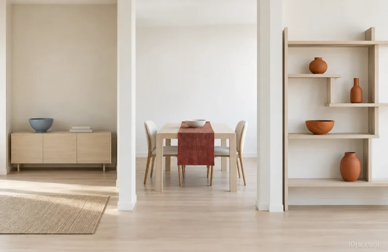
Two long shelf bands create a horizontal frame for four orange forms. Two sit toward the upper left and two toward the lower right, leaving a broad opening between them. That diagonal distribution offers a different rhythm from placing a matching pair at every end. Try it with a small group already on your shelves, while keeping books or useful storage where they belong. The empty middle makes this particular pairing easy to see; it is not a requirement to empty a working shelf.
- Why it works
- Opposite-end groupings balance orange forms across two horizontal shelves.
- Best for
- A low open shelf where a few displayed objects can form two groups.
- Check first
- Keep stored belongings in the comparison so the display still works on an ordinary day.
7Cream chair contrast
The cream chair has angular sides, and the round olive cushion gives those edges a softer contrast. This is the most direct shape pairing in the set: the cushion can be added or put aside without rebuilding the corner. Choose a cushion that is useful while sitting, then compare its outline with the chair. The pictured books and vessel sit on the floor, but they are not needed for the contrast; use a convenient place for your current book and keep the approach to the seat clear.
- Why it works
- One circular cushion interrupts the chair's angular outline.
- Best for
- An existing angular lounge chair that benefits from a small rounded accent.
- Check first
- The cushion should suit sitting in the chair, not only how it looks from the front.
8Stone desk profile
A long desk surface forms a strong horizontal band against the textured wall. The oval vessel and books sit on an ochre mat near one end, leaving the front and opposite side visually open. Compare the rounded vessel with the straight edges of the books: they can create enough variation without another object. This example describes the visible profile, not how a desk is supported or installed. Apply the accessory comparison to a desk you already use and retain the space your work needs.
- Why it works
- The oval vessel breaks up the desk and book edges without dominating the surface.
- Best for
- An established writing desk with a strong straight outline.
- Check first
- Judge the arrangement with your actual work materials laid out on the desk.
9Mushroom bench sweep
The bench's curved front is the main feature, with two cushions gathered at one end and a violet throw draped over the other. The asymmetry lets the textile accents occupy different amounts of space. Compare the draped throw with a smaller folded version if you want more of the rounded seat edge visible. Keep the fabric where it remains convenient for sitting rather than arranging it only for a photograph. The curve can carry the room even with a single cushion.
- Why it works
- A broad curved seat links two unequal textile groups.
- Best for
- A curved bench or small sofa whose shape already has character.
- Check first
- A throw that repeatedly gets in the way can be stored beside the seat instead.
10Ivory seating frame
A straight-backed low sofa faces two rounded chairs, making the furniture itself the line-and-shape pairing. Emerald cushions echo the darker bowl behind the seating, while a pale vessel keeps the opposite side lighter. Notice how the accents are distributed before adding any more. Your own working layout can keep its useful center table; compare the furniture outlines around it rather than copying the empty center exactly. This direction is most useful when the larger pieces already suit the room.
- Why it works
- Rounded chair fronts contrast with the sofa's horizontal back and seat.
- Best for
- A seating area with both straight and curved furniture already in use.
- Check first
- Preserve the tables and surfaces people need; the pictured open center is only one option.
Frequently asked questions
How do I choose between straight and curved shapes?
Start with the larger furniture you already have. Identify its strongest outline, then compare one smaller contrasting shape beside it, such as a round cushion on an angular chair.
Does every room need a bright accent?
No. The accent colors make these examples easy to compare, but a difference in shape or texture may already be enough. Try the pairing before introducing another color.
Can a room include both old and newer furniture?
Yes. These comparisons concern how visible outlines work together, so you can start with familiar pieces from different times. A shared color or repeated curve may connect them.
What if the furniture itself already looks sculptural?
Let that outline lead and keep nearby accessories quieter. Compare the view without extra display objects first; a strong curved bench may need only a useful cushion.
How can I avoid buying things just to copy a picture?
Choose one relationship from the picture rather than its complete inventory. A bowl, cushion or textile you already own may provide the contrast you want to try.
Related posts
View all

About the author
10jar Editorial Team
The 10jar Editorial Team builds research-led visual decision guides. We document our criteria, cite consequential sources, state what we did not test, and correct material errors when we find them.
Follow 10jar on Pinterest