
How this guide works
Minimalist interior design can start with the furniture you already use: clear the competing decoration, choose one shape or color to notice, and leave enough of the surrounding surface empty for that choice to stand out. A sofa does not need another cushion just because there is space for one. A console can look finished while its ends remain bare. Start with a single zone rather than trying to make every room equally sparse.
The ten examples below explore different places to simplify, from an entry console to a desk. Their object counts describe the illustrated combinations; they are not shopping lists or rules for your home. Keep the things your day actually requires, even when a photograph would look tidier without them.
Decide what the room can do without
Choose the view you see most often, then identify the pieces that support how you use it. A minimalist direction can leave an existing sofa, table or bed as the main feature. Compare the surface before and after putting aside one optional decorative group. Keep the version in which the useful furniture is easier to notice and everyday objects still have a place.
Tate uses composition to describe how elements are arranged in an artwork. Applied here as a way of looking, the useful question is what draws attention first. If a tray, a vase and the furniture all seem to demand equal attention, try removing one accent before changing the furniture.
Let the furniture supply the main shape
Look at the outline already present. A long console offers a horizontal line; a rounded chair offers a curve; an open shelving unit gives you a grid. Choose a small detail that works with that outline instead of covering it. The dresser example uses a cluster of different heights, while the bed example leaves the upholstered rectangle almost uninterrupted.
Tate’s discussion of form includes shape and the physical character of an artwork. That vocabulary helps distinguish a low block from a curved seat. It does not make one furniture style compulsory: a familiar piece can stay if its outline is the part of the room you want to emphasize.
Choose where the accent should end
A dark tray on a pale console and two blue cushions on a neutral sofa make different demands on a room. Decide which surface should carry the contrast, then leave the neighboring surface quieter. A woven cover or a ribbed vessel can add texture without introducing a second strong color.
Proportion, in Tate’s art vocabulary, concerns relationships between parts and the whole. Use that idea to compare the accent with the furniture around it. A small dark object may already be conspicuous against a pale background; enlarging the accent is not automatically an improvement.
Check the view you actually live with
Look from the doorway, the sofa or the chair where you normally sit. A close photograph can hide the objects at the edge of a surface and make a room seem emptier than it is. Compare like with like if you use photographs: keep the frame and viewpoint consistent while deciding which version you prefer.
Tate explains perspective as representing three-dimensional space on a flat picture. A picture is useful for comparing the arrangement, but it is not a room measurement. Keep everyday access and the actual use of the furniture in mind when translating a visual idea into your own space.
Stop when the space still works for you
Read the selector’s existing-zone column first. Then choose the empty area worth protecting: the usable center of a sofa, the front of a desk, or part of a shelf. If simplifying a surface makes its everyday job harder, bring back what that job needs. The aim is a deliberate arrangement you can maintain, not a room that has to be cleared for every photograph.
For a direction built around stronger geometry, compare the Art Deco interior design ideas. For warmer furniture shapes, see mid century modern decor ideas. If you prefer more symmetry and detail, the traditional interior design ideas offer a different starting point.
On this page
1Ivory entry plane
Let the long edge of an existing pale console stay visible. In this example, a charcoal tray and two light forms make a small central group; the empty ends carry as much of the composition as the objects. Try putting aside optional decoration at both ends before deciding whether another accent is needed. If the console also holds keys or mail, give those items an intentional place rather than clearing them only for a picture. This direction suits a view where the wall and furniture already have a simple outline. A busy wall may need a different starting point, so compare the whole entry view before focusing on the tray.
- Why it works
- The dark tray provides contrast without interrupting the full console outline.
- Best for
- An entry console whose useful daily items can share a restrained display.
- Check first
- Treat the two forms as an example, not a reason to buy matching objects.
2Oat sofa pause
The open middle of this sofa is the point of the arrangement. Two ink-blue cushions frame the pale upholstery, while a low bowl repeats a rounded form on the table. Compare the sofa with the cushions at the ends and with one put away; either can be enough if you prefer more visible upholstery. Keep the seating you actually use available. A favorite blanket does not need to disappear to satisfy the image: fold it where it is convenient, then judge whether another decorative layer still earns its place. Choose this direction when the sofa itself already gives the room the shape you want.
- Why it works
- The pale center seat remains visible between two small areas of blue.
- Best for
- A neutral sofa that needs a restrained color accent rather than new upholstery.
- Check first
- Keep the center useful for sitting and put away decoration that prevents it.
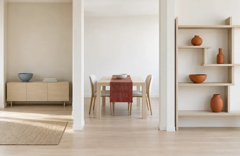
3Stone dining interval
A narrow oxide-red runner gives this pale table a single line of color. The bowl and two matching forms sit within that line, leaving the ends visually quiet. Start by comparing the runner alone with the complete illustrated group. If the table is used for meals every day, a version that clears easily may be more useful than the fullest display. Rounded chair backs soften the table edge without requiring extra objects on top. This option works best as a comparison of a few pieces you already have; it does not require a new table, matching chairs or a permanently styled dining surface.
- Why it works
- One red strip links the small group while the table ends stay open.
- Best for
- An existing dining table where decoration can be cleared easily for meals.
- Check first
- Try the runner alone first if a bowl and two forms feel unnecessary.
4Gray dresser horizon
Here the dresser remains a broad horizontal surface, with a small group of different heights and a deep-olive tray. The tallest ribbed vessel supplies the texture; the quieter neighboring shapes keep it from becoming one of many competing details. Compare the group gathered near the middle with the same pieces spread apart. Gathering them may make the untouched corners more noticeable, but the useful arrangement depends on what you keep on the dresser. Leave room for those everyday belongings. If the vessel already has a strong surface pattern, there is little reason to introduce several more textures around it.
- Why it works
- A tall textured vessel gives the low dresser one clearly visible accent.
- Best for
- A dresser with enough usable surface to keep a small display together.
- Check first
- The empty corners are a visual choice; keep space for belongings used daily.
5Bone bed frame
Use the bed itself as the main rectangle and let one slate-blue coverlet carry the color. Two pillows and plain side surfaces keep the example easy to read. This is a useful starting point when you like the existing headboard and do not want a collection of decorative cushions in front of it. Compare the coverlet spread across the bed with a smaller folded section if the blue feels too prominent. Keep bedside objects that you actually reach for; the illustration is not a rule that nightstands must be empty. Choose bedding by its real care instructions and your preferences, not by appearance alone.
- Why it works
- A single blue bedding layer contrasts with the otherwise pale bed outline.
- Best for
- A bedroom where the existing bed can remain the main decorative feature.
- Check first
- Keep useful bedside items even when the pictured surfaces are completely bare.
Quick comparison: all 10 ideas
Swipe or scroll horizontally to compare every column.
| Design Direction | Best Existing Zone | Open Volume | Dominant Form | Texture Restraint | Dark Note | Object Grouping | Visual Stop Check |
|---|---|---|---|---|---|---|---|
| Ivory entry plane | Entry console | Open wall above | Long low rectangle | One smooth tray | Charcoal | One tray and two matte forms | Stop before either console end is filled |
| Oat sofa pause | Living seating | Clear center seat | Low soft block | Two woven cushions | Ink blue | Two cushions and one low bowl | Stop while the center seat reads as empty |
| Stone dining interval | Dining table | Open table ends | Straight slab and round backs | One flat runner | Oxide red | One runner, one bowl, and two matching forms | Stop before the table ends gain objects |
| Gray dresser horizon | Dresser top | Blank outer corners | Single horizontal plane | One ribbed vessel | Deep olive | One tray and three graduated vessels | Stop when both outside corners stay blank |
| Bone bed frame | Bed zone | Clear bedside planes | Low upholstered rectangle | One washed coverlet | Slate blue | One coverlet and two pillows | Stop without adding bedside decor |
| Ash shelf void | Open shelf | Empty center bay | Offset rectangular grid | Matte ceramic only | Burnt clay | Exactly four forms across two shelves | Stop while the central bay remains empty |
| Putty chair arc | Reading corner | Open floor crescent | One rounded chair | One looped cushion | Forest green | One chair, one cushion, two blank books, and one vessel | Stop before the floor crescent closes |
| Pale desk band | Writing desk | Empty front edge | Slender rectangle | One fine linen mat | Ochre | One mat, two blank books, and one vessel | Stop while the work band remains clear |
| Mushroom bench break | Deep bench | Exposed seat edge | One rounded bench | One folded throw | Dusty plum | Two cushions and one folded throw | Stop before the front edge disappears |
| Ecru seating gap | Sofa-and-chair zone | Open center floor | Low block with paired curves | Smooth and woven only | Deep teal | Two cushions, one bowl, and one ceramic form | Stop while the center gap remains legible |
6Ash shelf void
The open middle bay makes the shelving structure part of this display. Four clay-colored forms sit around that opening, so the shelves remain easy to distinguish from their contents. Before adding anything, try removing an optional group from the busiest bay and look at the shelf from across the room. If it stores books or daily supplies, preserve their useful places rather than forcing the whole unit to resemble this example. The four-form count belongs to this composition; fewer objects may make more sense on a smaller unit. Compare spacing and the amount of shelf still visible before adding another color.
- Why it works
- An empty central bay gives the surrounding shelf grid a clear outline.
- Best for
- Open shelving that combines a small display with deliberate stretches of empty space.
- Check first
- Do not remove useful storage just to match the illustrated four-object count.
7Putty chair arc
A rounded chair gives this corner its main shape. The green cushion adds one darker patch, while two books and a vessel sit beside the seat. Start with the chair and the book you use, then decide whether the extra object contributes anything. Keeping part of the floor visible can make the chair outline easier to notice, but a decorative floor arrangement should not replace a practical place to put down a book or walk through the room. This direction is most useful when an existing comfortable chair is already in a suitable spot. There is no need to furnish an otherwise unnecessary reading corner.
- Why it works
- One green cushion emphasizes the rounded chair without adding several competing patterns.
- Best for
- An established chair corner that can be simplified around how you use it.
- Check first
- Give the current book a usable resting place before adding decorative vessels.
8Pale desk band
The ochre mat defines a small part of this pale desk while the front remains clear. Two books and one vessel sit outside that working band. Compare the desk when it is ready for the task you actually do there: writing, reading or another activity may need more space than a styled photograph suggests. Put away an optional object if it keeps being moved before work can start. The mat supplies enough color to make a separate colorful accessory unnecessary. This example is about editing what remains on the surface; it does not prescribe a desk height, chair position or workstation arrangement.
- Why it works
- The ochre mat concentrates color away from a usable strip at the front.
- Best for
- A writing surface where supplies can stay organized without occupying the working area.
- Check first
- Set out the materials your task needs before deciding what decoration can remain.
9Mushroom bench break
A curved bench can carry the arrangement with only a restrained textile accent. In this example, two plum cushions and a folded throw leave much of the front edge visible. Try one cushion before committing to the full group, especially when the bench is used for putting on shoes or sitting briefly. A throw that repeatedly slips into the way may be better stored nearby. The useful comparison is between a bench that looks deliberately simple and one that must be cleared every time someone sits. Keep the furniture outline apparent, but let its everyday purpose decide how much decoration stays.
- Why it works
- The visible curved seat edge keeps the cushions from defining the whole bench.
- Best for
- An existing bench where a small textile accent does not displace everyday seating.
- Check first
- One cushion is a complete option if two leave too little usable seat.
10Ecru seating gap
The low sofa and two curved chairs create the main relationship in this seating area. Teal cushions, a bowl and one tall form supply a few darker and lighter accents around it. Look at the group from the usual approach to the room and decide whether a decorative object interrupts the furniture outlines. The open center is a feature of this example, not a reason to remove a useful table from your own room. If a table is needed, simplify its surface instead. Choose this direction when the seating already works and the remaining decision concerns which accents deserve attention.
- Why it works
- The contrast between the low sofa and curved chairs carries the composition.
- Best for
- A working seating arrangement that needs fewer competing accents around its edges.
- Check first
- Keep a useful center table if needed; simplify its display rather than copying the empty floor.
Frequently asked questions
Do minimalist rooms have to be white?
No. These examples use pale backgrounds to make the comparisons clear, but you can begin with the colors already in your room. Limit competing accents before considering a new wall color.
How many decorative objects should I keep?
There is no required count. The selector describes the pictured groups. Start with the useful objects, then keep only the optional pieces that add something you want to see.
Can I keep sentimental objects in a simple room?
Yes. Choose a place where a favorite object can be noticed instead of surrounding it with several unrelated accents. A deliberate display can include meaningful belongings without filling every surface.
What if an empty surface is not practical?
Keep what the surface needs for its everyday job. A bedside table, desk or entry console can be visually simple while still holding the things you use there.
Should I buy new furniture to get started?
Start with one piece you already like and compare the surrounding decoration with some of it put aside. A useful existing sofa, table or bed may already provide the main shape.
Related posts
View all

About the author
10jar Editorial Team
The 10jar Editorial Team builds research-led visual decision guides. We document our criteria, cite consequential sources, state what we did not test, and correct material errors when we find them.
Follow 10jar on Pinterest