
How this guide works
Transitional interior design ideas can help you bring different furniture shapes into the same room. Begin with a piece you want to keep, then compare its straight edges with a softer detail nearby. A rounded cushion can change the feel of a plain sofa; a simple table can give shaped chairs a quieter companion. The aim here is a room whose pieces relate without all looking alike.
Decide which existing piece should lead
Look at the largest outline first. A long console, low sofa or rectangular desk may already organize the room. Let that piece set the broad direction, then choose a smaller detail that adds something different. You can do this with furniture and accessories you already own; start by bringing two pieces into the same view before looking for another.
Tate uses composition to describe the arrangement of elements in an artwork. The editorial application here is the relationship between a large outline and the details around it. A small vessel may give a console enough contrast without another piece of furniture beside it.
Compare a soft detail with a clear edge
Find the change in shape: a fluted tray on a straight console, a round cushion on a broad sofa, or a curved chair beside a rectangular table. The contrast is easiest to notice when each shape remains visible. If you cover the straight edge with fabric or surround the curve with several similar objects, the two features may stop reading as a pair.
Tate’s discussion of form includes physical nature and shape. In these examples, study the actual silhouette rather than deciding that every curved object belongs to one period or every straight piece belongs to another. A rounded upholstered arm can work beside a clean tabletop without requiring a historical label.
Change the amount before changing the whole room
A cushion and a coverlet introduce color at very different scales. Try the smaller change first when you are unsure. On a wide dresser, compare one compact vessel group with the same pieces spread farther apart. Keep the arrangement that suits what the furniture does, whether that means a place for daily belongings or a seat you can use comfortably.
Proportion, in Tate’s definition, concerns the relationship between parts. A large plain surface can make a little color feel prominent. There is no need to fill a tabletop simply because the furniture is wide, or to use identical object counts on pieces of different sizes.
Let color connect the pieces you want to keep
Choose an accent from a textile or object that already works in the room. Moss green can appear in two sofa cushions; a blue coverlet can give a pale bed its strongest color; a small teal bowl can echo cushions across a seating area. Repeat the color where it is useful or enjoyable, then leave some surrounding surfaces plain.
Photographs make some relationships easier to see and hide others. Tate describes perspective as representing three-dimensional space on a flat image. Check your own color link from the seat or entrance you normally use. An accent hidden behind an armchair may contribute less than a cushion that is visible from the doorway.
Finish with room for ordinary use
The open area depends on the furniture. At a desk, it is space for papers or a computer. On a bench, it is a comfortable place to sit. At a console, it may be an easy spot to put down keys. Use that daily purpose to decide when to stop adding details. An empty patch in a picture is an option to consider, not a fixed requirement for your room.
For stronger geometric contrasts, compare Art Deco interior design ideas. For a different mix of warm tones and furniture shapes, see mid century modern decor ideas. The traditional interior design guide offers another way to think about balanced details.
On this page
1Ivory entry bridge
The slim dark console draws one clear horizontal line across the pale wall. A ring form and small pale ball sit at the left, a fluted tray occupies the middle, and a blue vessel adds color at the right. The tray’s ribbed edge is a small detail against the simple frame. Choose the part of this relationship your entry needs: a useful tray may be enough beside one favorite object. Leave a convenient place for whatever you normally put down when coming home.
- Why it works
- A fluted tray adds fine detail to a plain dark furniture line.
- Best for
- An entry console where a small useful group can soften the outline.
- Check first
- The image has three forms plus a tray; choose the pieces that serve your entry.
2Oat sofa balance
Two round green cushions soften the broad back and straight lower edge of this pale sofa. A shallow green bowl repeats their tone on the round table. The central seating area remains available, so the color stays around the edges rather than filling the whole sofa. Compare a round cushion with a square one you already have and notice which relationship you prefer. The bowl is optional; the two cushions can establish the green accent by themselves.
- Why it works
- Rounded green cushions contrast with the sofa’s broad rectangular cushions.
- Best for
- A pale sofa that needs a small, coordinated color change.
- Check first
- Keep the center comfortable for sitting instead of following a fixed cushion count.
3Stone dining blend
A red runner brings a strong strip of color to the rectangular pale table. The darker chairs have shaped rails and narrow backs, while the table keeps a broad, simple outline. A low bowl and two pale forms sit along the runner. If your chairs already carry detail, try a plain runner before adding patterned place settings. Judge the width and length with the table set for a real meal, then keep the decorative pieces easy to move.
- Why it works
- A plain red runner links the long tabletop to smaller shaped chair details.
- Best for
- A simple dining table paired with chairs that have more visible detail.
- Check first
- Leave the places used for serving and eating convenient to reach.
4Greige dresser pair
The pale dresser’s drawers form long, straight bands. Near the right end, three pale vessels rise to different heights, with a teal tray placed just to their left. Most of the left side stays open. The tray supplies the color while the vessels supply curved profiles. You can use this approach with a smaller group: keep related shapes near one another, then compare their height against the width of the furniture before deciding whether another object helps.
- Why it works
- A small teal tray sets off pale curved vessels against horizontal drawers.
- Best for
- A wide dresser with room for a compact group at one end.
- Check first
- The vessels stand beside the tray; leave room for the belongings used every day.
5Cream bed interval
A soft upholstered headboard frames two pale pillows above a slate-blue coverlet. The broad blue field is the main accent, while its visible edge gives the otherwise pale bed a clear outline. Both bedside tables are simple. Try the coverlet with your existing pillows before adding another color to them. If the blue already feels dominant, the pale upper bedding may provide enough contrast without decorative objects on both sides of the bed.
- Why it works
- A broad blue textile gives definition to soft pale upholstery.
- Best for
- A pale bed where one useful coverlet can supply the accent color.
- Check first
- Use the bedside surfaces for what you need; empty tabletops are not a rule.
Quick comparison: all 10 ideas
Swipe or scroll horizontally to compare every column.
| Design Direction | Best Existing Zone | Quiet Field | Soft Detail | Clean Line | Accent Note | Object Grouping | Visual Stop Check |
|---|---|---|---|---|---|---|---|
| Ivory entry bridge | Entry console | Open wall band | Soft fluted tray | Slim dark console | Ink blue | Fluted tray, pale ring, pale ball and blue vessel | Keep an everyday drop-off area useful |
| Oat sofa balance | Living seating | Clear center seat | Rounded cushion profile | Straight low sofa | Moss green | Two cushions and one bowl | Keep the central seat comfortable |
| Stone dining blend | Dining table | Table space around the central group | Shaped narrow chair backs | Clean rectangular table | Oxide red | One runner, one bowl, and two forms | Keep room for a meal and serving |
| Greige dresser pair | Dresser top | Open left portion | Graduated vase curves | Long pale horizontal | Teal tray beside pale vessels | One tray beside three pale vessels | Keep room for daily belongings |
| Cream bed interval | Bed zone | Clear bedside planes | Soft upholstered headboard | Crisp coverlet edge | Slate blue | One coverlet and two pillows | Keep bedside space useful |
| Ash shelf cadence | Open shelf | Space between opposite object groups | Unequal rounded clay forms | Two straight shelf levels | Burnt clay | Two forms upper left and two lower right | Balance the display with real storage needs |
| Putty chair contrast | Reading corner | Usable area beside the chair | Softly rounded upholstered arms | Broad plain seat front | Forest green | Chair, green cushion, two books and floor vessel | Put reading materials where they are useful |
| Pale desk dialogue | Writing desk | Empty front band | Rounded vessel | Slender straight desk | Ochre | One mat, two blank books, and one vessel | Reserve the space needed for work |
| Mushroom bench mix | Deep bench | Exposed seat edge | Curved bench ends | Straight seat line | One plum cushion and plum throw | Pale cushion, plum cushion and draped throw | Keep the bench comfortable to sit on |
| Ecru seating accord | Sofa-and-chair zone | Open center floor | Paired rounded chairs | Low straight sofa | Deep teal | Two teal cushions, rear bowl and tall pale vessel | Keep the seating area useful with or without a table |
6Ash shelf cadence
Four burnt-clay forms occupy opposite ends of this pale shelf unit. A broad vessel and small ball sit at the upper left; a low rounded vessel and taller narrow vessel sit at the lower right. Their shared color connects the two pairs while the straight shelf edges remain visible. Compare the effect with fewer pieces if the shelves also store books. The useful relationship is the movement between different heights and positions, rather than a requirement to reserve a formal center compartment.
- Why it works
- One warm color connects unequal shapes placed at opposite shelf ends.
- Best for
- An open shelf where a small display can share space with storage.
- Check first
- There are two open levels, with space between the object groups.
7Putty chair contrast
A dark green cushion stands out against the pale chair’s softly rounded arms and broad seat. Two books and a brown vessel are pictured on the floor beside it. Focus first on the cushion: one darker textile can give a simple upholstered chair a clearer center. For everyday reading, keep your book where it is easy to reach, using a suitable nearby surface if that works better than the arrangement shown. The chair does not need another decorative layer to establish the color contrast.
- Why it works
- A dark cushion gives a softly shaped pale chair a distinct focal area.
- Best for
- An existing reading chair that needs a small contrast in color.
- Check first
- Books and vessel are on the floor in the image; arrange your reading things for convenient use.
8Pale desk dialogue
The desk has a thin top and slender straight legs, with a warm ochre mat centered on the surface. Two pale books sit to the left and a rounded vessel to the right. The mat provides a broad rectangle within the larger desktop; the vessel supplies a smaller curve. Begin with the mat you actually need for work and judge its color beside the desk. Keep an accessory only if it leaves enough space for the papers or device you use.
- Why it works
- An ochre rectangle and a pale curve add contrast to a slender desk.
- Best for
- A writing desk where a useful mat can be the color accent.
- Check first
- Reserve the work area before deciding where a decorative vessel belongs.
9Mushroom bench mix
Rounded padded ends soften this bench’s long straight seat. A pale cushion and a dusty-plum cushion sit together at the left, while a plum throw drapes over the right end. Repeating the plum color connects two areas without adding another shape between them. Try a useful throw in that position and sit down before deciding whether both cushions should stay. The center can remain available even when the fabric falls over one end.
- Why it works
- A plum cushion and draped throw connect opposite ends of a soft bench.
- Best for
- A deep bench that can carry a few comfortable textile layers.
- Check first
- The throw drapes over the end; adjust it so the seat stays convenient to use.
10Ecru seating accord
A straight pale sofa sits between two rounded upholstered chairs. Two teal cushions give the sofa its strongest color, and a teal bowl repeats it on the rear-left cabinet. A tall pale vessel stands behind the right chair. The central floor is open in this scene, making the contrast between the straight sofa and curved chairs easy to see. Keep that shape relationship if you add a useful coffee table or side table; the arrangement should still support how you sit, talk and move through the room.
- Why it works
- Curved chairs frame a straighter sofa, with teal linking cushions to a rear bowl.
- Best for
- Different seats that can relate through shape and a repeated accent color.
- Check first
- A useful table can be part of your room; the pictured empty center is one option.
Frequently asked questions
How do I combine furniture that does not match?
Look for one relationship you enjoy, such as a straight sofa beside curved chairs or a repeated textile color. Keep that connection visible before trying to make every piece share the same finish or shape.
Should the softer detail be a large piece?
It can be as small as a cushion or tray. Start with the piece you already have, then compare how much contrast it adds to the larger furniture outline.
Can I keep a useful coffee table in the middle?
Yes. The examples show different amounts of open area. Include the surfaces you actually use and judge the shape and color relationships with those pieces present.
Does an accent have to appear three times?
No fixed count is needed. One strong textile may be enough, while a quieter color might work in two places. Stop when the connection is clear and the room remains comfortable.
What should I remove when the room feels busy?
Temporarily take away a detail that repeats something already present. Compare the view and everyday use before removing a piece that serves a useful purpose.
Related posts
View all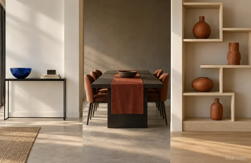

About the author
10jar Editorial Team
The 10jar Editorial Team builds research-led visual decision guides. We document our criteria, cite consequential sources, state what we did not test, and correct material errors when we find them.
Follow 10jar on Pinterest